BAD:
This looks like something that's done in a hurry. The image of the t-shirt is standing out, not exactly in the good way, and it looks really out of place. Moreover, the font and texts just really repels people away (no offence).
The arrangement of the texts in this poster is not one that i would recommend as it makes the whole poster look really messy. Also, it is risking a case of information overload. Too many dates, venues etc, will just leave the audiences confused. As the human brain prefers to process simple stuff, this poster would not be as effective when it comes to bringing across the message as there are information literally all over the place.
Good:
I'm rather fond of this design as the overall aesthetic appeal of it is really rather amazing. Plus, it has the 'stopping-power' which would make people stop and look at it. Strictly black-and-white with less formal looking fonts, it effectively portrays the professional yet hip and trendy vibe. As such, it is one of my favourites.
This is a very daring design as like i've mentioned above, posters that are wordy tend to risk information overload. However, the treatment of this poster and the one under the 'Bad' category is rather different. Texts are arranged in a manner that's not so messy and the fact that the designer effectively used the element of high contrast (black and white) makes this poster a good one. It looks professional with a twist. Something that i look out for when it comes to poster designs for academic events etc etc.


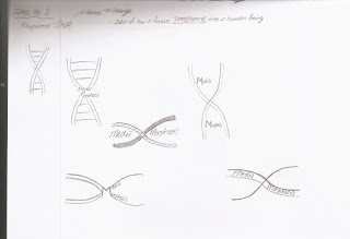
 Sketches and variation for the typography design exercise. :)


 This is an amazingly clever design. It is simple and definitely memorable since it's highly relevant to what it's supposed to portray. Moreover, it effectively symbolises the 'Food', with the fork, and the 'Wine' with the wine bottles, both incorporated into one.
 This logo design is not exactly good as the image and the words, when arranged in this way, would give an illusion that the brand name is 'Sinkist' instead of 'Sunkist'.


